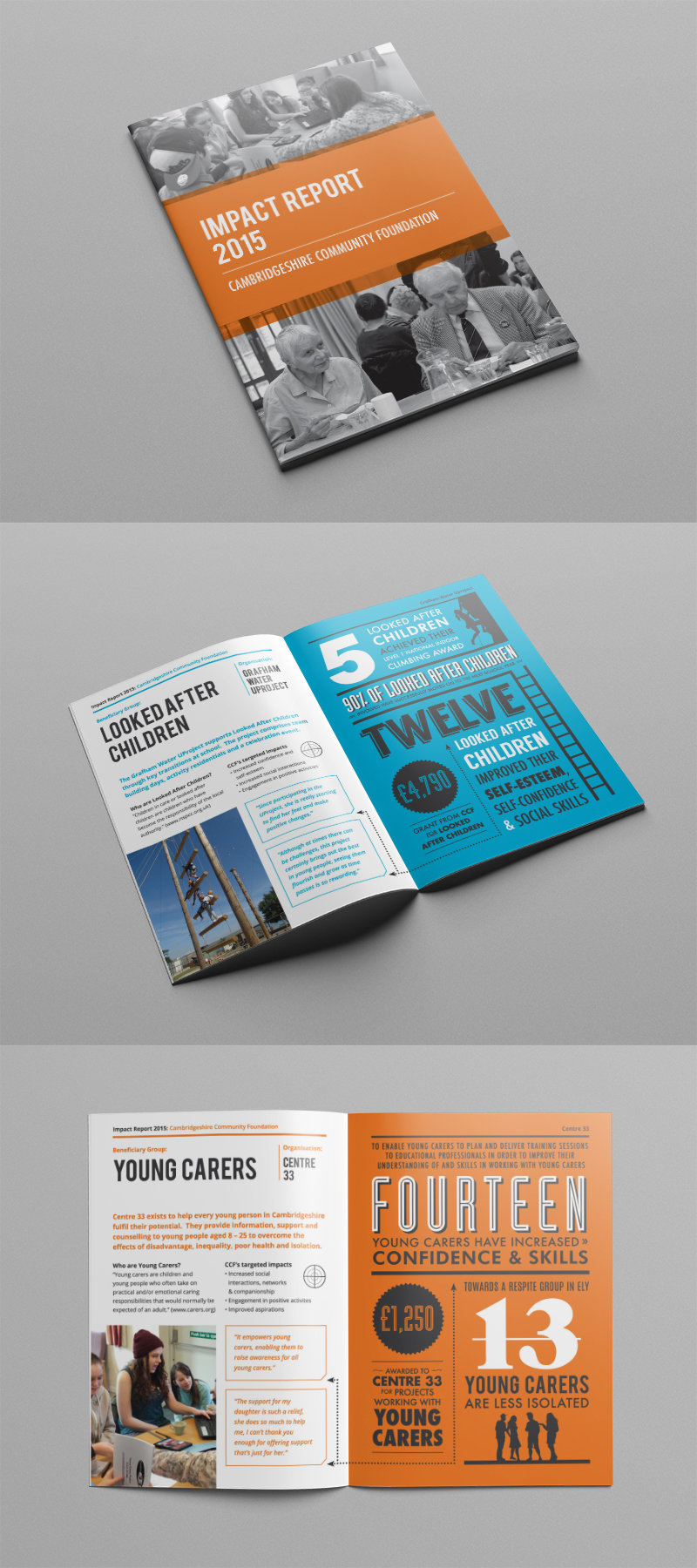
A fun graphic design project – we were asked to design the Impact Report and Vital Signs reports for a Cambridge-based charity. Cambridgeshire Community Foundation required a dynamic way to present their data. We now design the reports every year! Working initially with an infographic style for both reports. This year we have simplified the graphical style to a two colour layout. For each double-page spread design we focused on typography to get their message across effectively.
The reports are designed for printing at A5 and so it is important that the figures and the company’s message stands out. This is helped by the simple colour scheme and the retro typography on the right-hand pages juxtaposed with the simple, easy-to-read information on the opposite page.
To find out more about the great work Cambridgeshire Community Foundation do – please visit their website.


